
BluEclipse
☰
BluEclipse
BluEclipse weather technology
A weather screen is looked at for about four seconds. Everything difficult about building one follows from that — because the data is easy to obtain and very hard to communicate.
BluEclipse's Weather Platform is a mobile-focused weather system built around the iWeathar ecosystem, combining live environmental data, forecasting, location awareness and interactive visualisation in one application.
Weather stations produce a lot of information, and almost all of it is useful to somebody:
Displaying all of it does not make an application useful. It makes a wall. The actual engineering question is which information is promoted, how it is grouped, what gets a visual treatment and what stays a number — and how all of that survives being resized to a phone.
Which puts this work somewhere between software engineering and information design, and means a decision about layout is as consequential here as a decision about data structures.
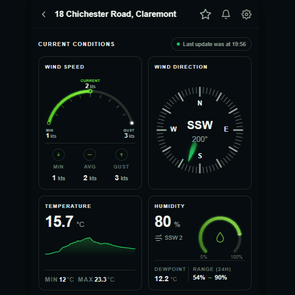
People do not study a weather app. They open it to answer one question — is it getting hotter, is rain coming, which way is the wind going, has anything changed — and then they close it. The interface has a few seconds to land the answer.
A number alone rarely manages that. 245° is precise, correct and almost useless at a glance: reading it requires converting a bearing into a direction in your head before you learn anything. A compass answers the same question spatially, without the conversion.
The needle carries the current bearing. The arc behind it carries the range the wind has been moving through — one component, two questions.
Speed shown against its recent minimum and its gust, so the number arrives already compared to something.
A current value with its own recent history attached, because the trend is usually the thing being asked about.
Components reproduced from the interface above at legible size
The compass is the clearest example of why standard UI components run out. There is no off-the-shelf control for “a bearing, plus the arc it has been oscillating across”, and that second part is genuinely useful information — a wind holding steady at 200° and a wind swinging thirty degrees either side of it are different conditions that a single number reports identically.
A measurement answers the question you asked. A good visualisation answers the question you were actually asking.
Unlike a content application, weather software deals with data that keeps changing underneath it. New observations have to be retrieved and processed, the interface has to update without becoming unstable, stale information has to be recognised as stale, and every measurement has to keep the context that makes it meaningful — where it was taken, and when.
That last point is why the screenshot above carries the time of the last update. A weather reading with no timestamp is not a weather reading; it is a number that was true at some unspecified point.
Weather is also inherently geographic. A measurement's usefulness depends entirely on where it was recorded relative to where the person asking happens to be, so the platform is built around location-aware experiences rather than treating position as a filter applied afterwards.
A desktop dashboard can expose dozens of values at once and let the eye do the filtering. A phone cannot, and a mobile weather app built by scaling a dashboard down is a familiar, bad experience.
The iWeathar work therefore made deliberate decisions about hierarchy, spacing, interaction, scrolling behaviour, visual density and the relationship between a summary and the detail behind it — designed around how people actually check conditions on a phone rather than around what a desktop layout already contained.
Most of these visual elements recur, so they are built as a shared system rather than rebuilt per screen:
New weather views then become compositions rather than fresh work, and the visual language stays consistent across the application by construction instead of by discipline.
Weather apps get opened outdoors in direct sunlight and in bed at midnight, so both light and dark presentations matter. That is more than swapping a background colour: borders, highlights, graphical indicators, contrast, typography, gradients and the environmental visualisations themselves all have to keep their relative emphasis in both modes.
A gauge that reads as the brightest thing on a dark screen can become the faintest on a light one, and when that happens the hierarchy inverts — the interface still works, but it is no longer saying the same thing.
Weather software quietly combines a set of problems usually handled by different teams:
| Discipline | The problem it owns |
|---|---|
| Data acquisition | Getting observations in, and keeping them current |
| Application state | Updating continuously without the interface becoming unstable |
| Responsive frontend | Dense information that stays legible on a phone |
| Data visualisation | Turning measurements into something read at a glance |
| Interaction design | Hierarchy between a summary and the detail behind it |
And then the last requirement, which is that all of them work together consistently across the devices people actually own.
Part of this work is iWeathar Lite, a mobile-focused implementation being developed around a streamlined weather experience. It explores how rich environmental information can be presented without the interface feeling like a technical weather console — detailed data in a much more visual, modern mobile interface, which has meant building custom visual components rather than relying on conventional dashboard libraries.
The value is not confined to one interface. Reusable weather components, environmental data processing, location-aware architecture and responsive visualisation can underpin several applications — from lightweight consumer apps to more specialised environmental dashboards — because the hard parts were built as a platform rather than as screens.
The principle running through all of it is that a measurement and an answer are not the same thing. Degrees become compass positions. Ranges become arcs. States become indicators. Groups of readings become a hierarchy where the most important thing is seen first.
Weather is an interesting software problem precisely because the data is only half of it. A technically complete weather application can still be difficult to use if people cannot quickly work out what it is telling them — which makes the communication problem the real one.
Built by BluEclipse. Developed around the iWeathar ecosystem.
If your application has more to show than a screen can hold, the problem is usually hierarchy and visualisation rather than more features.
Custom visualisation components, real-time data interfaces and mobile applications built around information rather than dashboards.